Saturday 21st March 2009

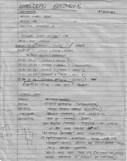
 These were notes I wrote last Saturday and were the original notes made for the idea of the assignment. As you can see from the notes, the first thing I did in the process was to listen to the piece of music to help me structure my ideas. By listening the music and breaking it down into "segments", I was able to structure my thoughts into segments as well.
Wednesday 25th March 2009

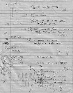
 These notes were written on the Wednesday to try and structure exactly how I was going to go about creating the video. It was a test of logic for me to think about explactly how many slides would need to be cut in order to do what I wanted. As these notes show, I originally estimated I would need to cut a lot more slides than I did, due to not thinking creatively enough, at the time, about how I would photograph the frames. It was at this point I decided to abandon the use of colour in the video. With the number of slides I was estimating, the workload was unrealistic, and something I could afford to compromise with.
 When creating a "segment" I break them down into 4 parts. Each part is the melody of "Happy Up Here" (The song of my video, click here to see the video) played once. From this, I could sync the video in time with the music with very little effort. When planning the difficult Segment 7, I had to plan when each part of the segment would be shown in relation to each other. Segment 7 spanned 10 slides, but not all at once, so these diagrams in these notes helped me ground myself with what I was actually creating. The diagram in the top right was especially helpful in reminding me what I labelled as what and in which sequence they are shown.
 This was the vector I started to create (for Segment 7) on the evening of Wednesday for the Laser Cutting we had booked for Thursday. Originally (and as can be seen from my storyboard and notes [above]), my idea was to have ornate, asymmetrical flames that would evolve into a tower while licking at the air. I started trying to create this in Illustrator, but realised that such asymmetry would not only take an incredibly long time to do well, but also, may jar with the rest of the video, as symmetry is something that has always been present. I did want the sequence (which was Segment 7) to stand out, but it still needed to be in the same aesthetic language as the rest of the video. The boxes in the image are the bounding boxes for a slide (maximum width and maximum height)- a template I used throughout the process of making the video.
 The final paper cut ready for printing using the laser cutter. If you click on the image above to get a larger version, you'll see that each "Mini Slide" (I call them that because they are not the full width of a normal slide due to space reasons) is listed with a code. Each code is something liek A1A[2], which represents the letter associated with the slide (see above notes), then the part number, followed by the duplicate number (as the slides are mirrored, each letter part has a duplicate). I needed to have this so I would be able tot quickly group up each Mini-Slide.
Thursday 26th March 2009
 Thursday was paper cutting day. After I got my vector cut, I carefully detatched them from each other and took them home in a plastic box. While talking with Ryan at the FBE Workshop, I explained how I originally intended to paint my slides, but had given up on that idea because of time. He suggested that I spray paint the model, as it is very quick and strengthens the pieces themselves. I decided, from this advice, to only spray paint the parts cut with the laser cutter, not only to highlight that that is the part of the video cut with the laser cutter, but also to exphasise the "climax" of the video, which is Segment 7. I spray painted them on Thursday evening, and placed double sided take underneath each piece and arranged them into their parts.
 Above is the templates for Segment 2. Segment 2 turned out to probably be the most complex and difficult to figure out segment than any other part video. As I created the templates for this segment, and was about to start cutting them into the shapes they needed to be, I realised I wouldn't have enough time to complete the rest of the video (or the quality of the video would be very unbalanced), so I compromised quite a bit. The site that "grows" out of the title frame (from Segment 1) was originally designed to be the full 16 slides of the slide box, but I changed it to 8 to speed up the process. Various other parts were shortened to also speed up the process. This allowed me to use the templates that were cut for segment 2 for the rest of the video (also compromising the detail of each other segment) without every having to cut any more.
 The same work environment as the image above, but after the entire cutting process and the finished slides had been removed. There were a lot of offcuts and left over templates.
 I then went about photographing the segments one by one. This was a simple process of arranging the slides for a frame, taking a photo, removing that slide and adding in another (of course some parts of segments were more complicated- part 1 of segment 2 [the growth of the site from the title] requires a full 16 different slides per 16 frames). This process was far quicker than the cutting, and went quite smoothly, despite some accidental tripod kicks, which is when the video jumps a little, from my inability to line up the camera again perfectly.
 If the image from the post on Wednesday (Segment 1) could be called the "Before" shot of the work environment, then this is the "After" shot. A lot of slides and pieces of double sided tape everywhere!
The editing process was very quick due to the careful planning pre-production and during the production process. Using Sony Vegas Movie Studio 9.0 (Trial) it was very easy to import the different parts of segments at different speeds, and stretch out frames to fill a part. Complications did arise with some of the frames (2 frames in Segment 3 had scissors in them, that were quickly covered up using the clone tool in Photoshop). I decided not to alter my raw images as I quite likes the warm light from the photos, and I wanted it to retain a "manual" look in a way. In my opinion, it made the box itself seem more "alive".

No comments:
Post a Comment